Causal Impact Analysis is a statistical analysis used to measure the effect of an intervention (policy change). Through the analysis, we are able to answer the following questions:
- Did the intervention have significant impact on the outcome?
- How much of the observed change can be attributed to the intervention?
Normally, when we want to assess these effects, researchers design randomized control trials to investigate this. However, these experiments are sometimes expensive or unethical and therefore not suitable.
Application
Impact analyses are applicable in diverse industries such as;
- Health: Impact of vaccinations to infectious disease cases, impact of lockdowns, impact of new drugs
- Economics: Impact of policy changes to economic indicators such as interest rates, balance of trade, consumer price indices
- Marketing: Impact of campaigns and promotions to customer behaviours
Assumptions
Like any other model, causal impact analysis are applicable under the assumptions
- Pre-intervention trend: The outcome variable should follow a stable trend before the intervention, allowing for a reliable counter-factual.
- Parallel trends: The treated and control groups should have similar trends before the intervention, ensuring that any observed differences in the post-intervention period are attributable to the treatment.
- Stationarity: The relationship between the control variables and the outcome should remain stable over time.
Implementation in R
Steps
To perform Causal Impact analysis in R, you will need:
- Install the package install.packages”CausalImpact”
- The dataset should contain the following variables a. Date b. Variable of interest containing values whose effect we are interested to analyze c. co-variate. This is any variable(s) that remain constant and are not directly impacted with the intervention
- Create time series objects for each of the variables in parts b and c 4. Define the pre-intervention and post-intervention periods
- Create a zoo object for all the variable
- Perform the analysis
Importing the Data
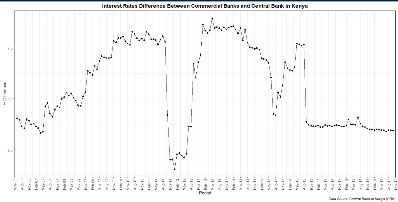
The data for this project is from the Central Bank of Kenya (CBK). It contains monthly interest rates set by the CBK, commercial bank interest rates for loans and deposits from June 2006 to October 2019. The Kenya gazette dated 31st August 2016 published the Section 33B of the Banking Act that had been introduced by the Banking (Amendment) Act, 2016. It provided for, among other things, a ceiling of 4% over the rate set by the Central Bank of Kenya on interest charged by financial institutions regulated under the Banking Act. This legislation saw Kenyans enjoy affordable interest rates and was abolished in October 2019 following the President’s recommendation to Parliament to repeal the interest rate cap law has sailed through Parliament, paving the way for the repeal of the law. The President refused to assent to the Finance Bill, 2019 (the Finance Bill) and referred the Finance Bill back to Parliament with a memorandum outlining the reasons for his refusal. His concern was the presence of the interest rate cap and he recommended that it be abolished by repealing section 33B of the Banking Act.
In this analysis, we assess the impact of this legislation. The variable of interest will be the difference between Commercial banks interest and CBK interest.
library(readxl)
Banking_Rates <- read_excel("Banking Rates.xlsx")

# Computing the diffrence in rates
library(dplyr)
Banking_Rates<-Banking_Rates %>% mutate(Month=as.Date(Month),
                                       Rate_Diff = Commercial -`Central Bank`)
Visualizing the Differenece in Rates
library(ggplot2)
library(scales)
library(plotly)
Rates_Plot<-ggplot(Banking_Rates) +
  aes(x = Month, y = Rate_Diff) +
  geom_line(colour = "#023020") +
  labs(x = "Period", y = "% Difference",
    title = "Interest Rates Difference Between Commercial Banks and Central Bank in Kenya",caption = "Data Source Central Bank of Kenya (CBK)") +
  scale_x_date(date_labels = "%b-%y", date_breaks = "3 months",
               limits = c(as.Date("2006-05-01"), as.Date("2019-11-01")),
               expand = c(0, 0))+
  geom_point()+
  theme_bw()+
  theme(plot.title = element_text(face = "bold", hjust = 0.5),
        plot.caption = element_text(face = "italic"),
        axis.text.x = element_text(angle = 90, vjust = 0.5))

Rates_Plot

Adding interactivity
Rateplot<-ggplotly(Rates_Plot) %>% layout(yaxis=list(fixedrange=TRUE),
        xaxis=list(fixedrange=TRUE))%>%
  config(displayModeBar=FALSE)

# Saving the interactive plot
htmlwidgets::saveWidget(as_widget(Rateplot), 'Rateplot.html')
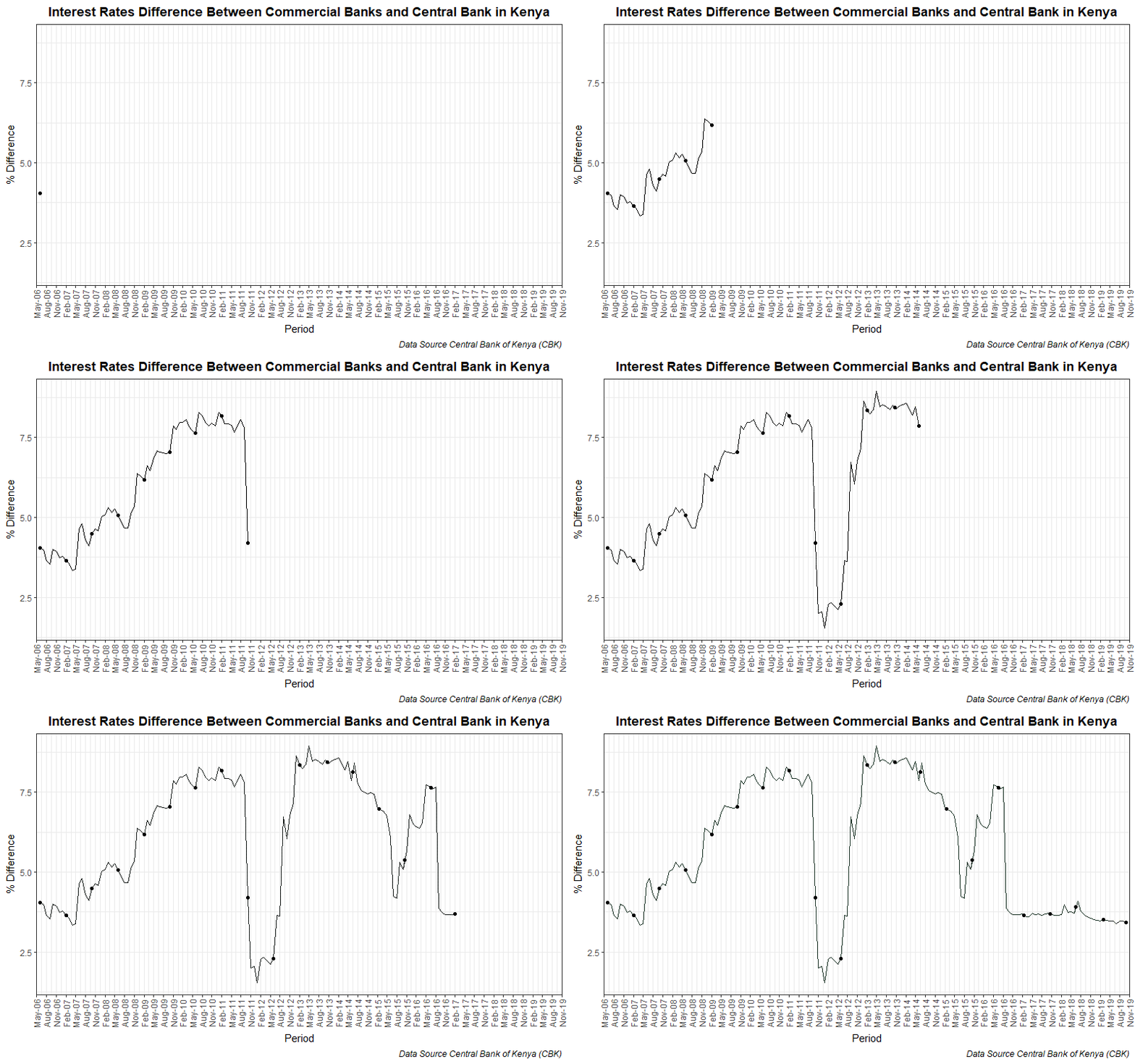
Creating Anime Object
library(gganimate)
Rate_plot.anime = Rates_Plot+transition_reveal(Month)+
  shadow_trail(distance = 0.05)

animate(Rate_plot.anime, height = 500, width = 800, fps = 30, duration = 10,
        end_pause = 60, res = 100)

anim_save("Interest Rates Difference.gif")
Preparing the Data for Impact Analysis
# defining pre-intervention period
pre_period<-as.Date(c("2006-06-01", "2016-08-01"))
# defining post-intervention period
post_period<-as.Date(c("2016-09-01", "2019-10-01" ))

time_period = seq.Date(as.Date("2006-06-01"), as.Date("2019-10-01"), by = "1 month")

# Creating the time series elements
Rate_dif<- ts(Banking_Rates$Rate_Diff)
Dep <- ts(Banking_Rates$Deposit)

# Merging the data
library(zoo)
Dif_Rate<-zoo(cbind(Rate_dif, Dep), time_period)
Causal Impact Analysis
library(CausalImpact)
impact <- CausalImpact(Dif_Rate, pre_period, post_period)
# Summary
summary(impact)
## Posterior inference {CausalImpact}
##
##                          Average         Cumulative
## Actual                   3.6             138.3
## Prediction (s.d.)        6.6 (1.2)       250.8 (43.9)
## 95% CI                   [4.4, 8.9]      [167.6, 336.5]
##
## Absolute effect (s.d.)   -3 (1.2)        -113 (43.9)
## 95% CI                   [-5.2, -0.77]   [-198.1, -29.25]
##
## Relative effect (s.d.)   -43% (11%)      -43% (11%)
## 95% CI                   [-59%, -17%]    [-59%, -17%]
##
## Posterior tail-area probability p:   0.00551
## Posterior prob. of a causal effect:  99.44904%
##
## For more details, type: summary(impact, "report")
Full Report
summary(impact,"report")
## Analysis report {CausalImpact}
##
##
## During the post-intervention period, the response variable had an average value of approx. 3.64. By contrast, in the absence of an intervention, we would have expected an average response of 6.60. The 95% interval of this counterfactual prediction is [4.41, 8.85]. Subtracting this prediction from the observed response yields an estimate of the causal effect the intervention had on the response variable. This effect is -2.96 with a 95% interval of [-5.21, -0.77]. For a discussion of the significance of this effect, see below.
##
## Summing up the individual data points during the post-intervention period (which can only sometimes be meaningfully interpreted), the response variable had an overall value of 138.34. By contrast, had the intervention not taken place, we would have expected a sum of 250.84. The 95% interval of this prediction is [167.59, 336.48].
##
## The above results are given in terms of absolute numbers. In relative terms, the response variable showed a decrease of -43%. The 95% interval of this percentage is [-59%, -17%].
##
## This means that the negative effect observed during the intervention period is statistically significant. If the experimenter had expected a positive effect, it is recommended to double-check whether anomalies in the control variables may have caused an overly optimistic expectation of what should have happened in the response variable in the absence of the intervention.
##
## The probability of obtaining this effect by chance is very small (Bayesian one-sided tail-area probability p = 0.006). This means the causal effect can be considered statistically significant.
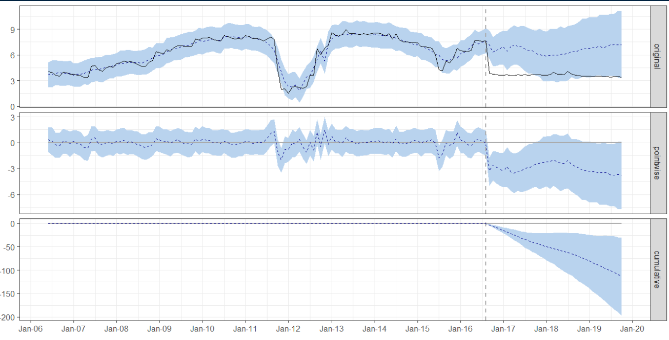
You can further plot the impact output as shown below
plot(impact)+scale_x_date(date_labels = "%b-%y", date_breaks = "1 year")

The topmost graph is the most important. The dotted vertical line is the intervention. The black line shows the difference in rates while the dotted blues is the predicted outcome if the intervention was not put in place. These predictions are based on probabilities computed prior to the intervention.
Conclusion
Causal Impact analysis is useful in assessing the impact of interventions. Note that causal impact is bounded by the assumptions and unobserved confounding factors may influence the outcome.
References
Justin Eloriaga. Justin Eloriaga (2020, July 30). Causal Impact Analysis in Time Series using R [Youtube Video]. https://youtu.be/H64ucBjgY6w Grab N Go Info. Grab N Go Info. (2022, Sept 15). Time Series Causal Impact Analysis in R Machine Learning[Youtube Video]. https://youtu.be/aUbUlquTrCg Kenya Law Weekly Newsletter. http://kenyalaw.org/kl/index.php?id=9166#:~:text=Relevant%20Provisions%20of%20the%20Law&text=%E2%80%9C(1)%20A%20bank%20or,the%20Central%20Bank%20of%20Kenya.%204.%20Kenya%20Gazette%20Supplement%202016 Kenya Gazette Supplement 2016. http://kenyalaw.org/kl/fileadmin/pdfdownloads/Acts/2016/No._25_of_2016.pdf