Linear Regression
Linear regression is a statistical method used to model the relationship between a dependent variable (the variable you want to predict) and one or more independent variables (the variables you are using to predict the dependent variable). It is a powerful tool for understanding and quantifying the relationship between variables, and has a wide range of applications in various fields such as finance, health, research, agricuture and manufacturing.
In this project we use data from an ecommerce company. This is a dummy dataset generated with the following variables:
- Email - Customers email address
- Address - Customer home address
- Avatar - Customer site avatar
- Avg. Session Length - The average time a session is known to taken to offer services/sales to a customer
- Time on App - The time in minutes spent by a customer on the company’s ecommerce app platform
- Time on Website - The time in minutes spent by a customer on the company’s ecommerce web platform
- Length of membership - The length of membeship of a customer
- Yearly Amount spent - Amount spent in dollars by a customer
For the dataset, the project shall model and predict how variables 3 to 7 affect yearly amount spent by a customer. Exploratory data analysis including distribution plots and correlation shall be performed before the buidling a model.
Exploratory Data Analysis (EDA)
Before building the model, it is important we understand the underlying relationships among the variables. EDA is the process of using visualizations and numerical summarizations to understand patterns within the data. To achieve this, we shall use some plots.
# Importing relevant packages and data
import numpy as np
import pandas as pd
import matplotlib.pyplot as plt
import seaborn as sns
%matplotlib inline
# importing the file
ecommerce = pd.read_csv('EcommerceCustomers.csv')
# run ecommerce.head() to view the first 5 variables
# Dropping the non-numeric variables
ecommerce = ecommerce.iloc[:, 3:]
# viewing the dataset description
ecommerce.info()
<class 'pandas.core.frame.DataFrame'>
RangeIndex: 500 entries, 0 to 499
Data columns (total 5 columns):
 #   Column                Non-Null Count  Dtype
---  ------                --------------  -----
 0   Avg. Session Length   500 non-null    float64
 1   Time on App           500 non-null    float64
 2   Time on Website       500 non-null    float64
 3   Length of Membership  500 non-null    float64
 4   Yearly Amount Spent   500 non-null    float64
dtypes: float64(5)
memory usage: 19.7 KB
Distribution of Numerical Variables
Histograms are useful plots in uderstanding the distribution of variables such as skewness.
sns.set(style='whitegrid')
# Create a figure and axes
numerical_columns = ['Avg. Session Length', 'Time on App', 'Time on Website', 'Length of Membership', 'Yearly Amount Spent']

fig, axs = plt.subplots(len(numerical_columns), figsize=(8, 26))

# For each numerical column, create a histogram
for i, col in enumerate(numerical_columns):
    sns.histplot(ecommerce[col], kde=True, ax=axs[i])
    axs[i].set_title(f'Distribution of {col}')
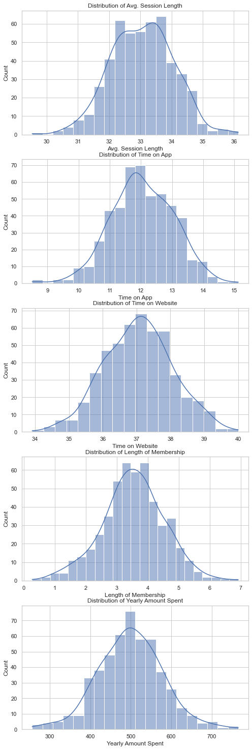
From the histograms, we can observe the following:
- Avg. Session Length: Most customers have an average session length around 33 minutes.
- Time on App: The time customers spend on the app is mostly around 12 minutes.
- Time on Website: The time customers spend on the website is mostly around 37 minutes.
- Length of Membership: Most customers have been members for around 3 to 4 years.
- Yearly Amount Spent: The yearly amount spent by customers is mostly around $500.
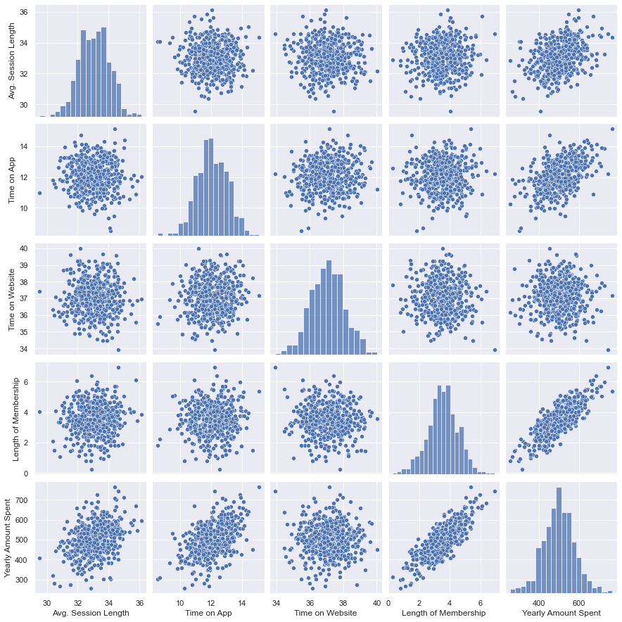
Pair Plots
These plots are used to compare variables pairwise. The results below show some linear relationships between:Yearly Amount Spent and Length of Membership
# Pairplot
sns.set_style('darkgrid')
sns.pairplot(ecommerce)
<seaborn.axisgrid.PairGrid at 0x28c08272580>
Correlation plot
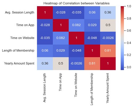
A heatmap is used to visualize the correlation - the measure of associaltion among the variables. From the heatmap, we can observe the following:
- Length of Membership has a strong positive correlation with Yearly Amount Spent. This suggests that the longer a customer has been a member, the more they tend to spend per year.
- Time on App also has a positive correlation with Yearly Amount Spent, indicating that customers who spend more time on the app tend to spend more per year.
- Avg. Session Length has a moderate positive correlation with Yearly Amount Spent.
- Interestingly, Time on Website has a very weak correlation with Yearly Amount Spent, suggesting that the time customers spend on the website does not significantly affect their yearly spending.
sns.heatmap(ecommerce.corr(), annot=True, cmap='coolwarm')
plt.title('Heatmap of Correlation between Variables')
Text(0.5, 1.0, 'Heatmap of Correlation between Variables')
Model Building with Linear Regression
Linear regression is one of the most useful and simple modes in data analysis. It allows us to assess the linear relationship between dependent and independent variables and make predictions of the dependent variables.
To perform this we shall take the following pathway:
- Import the model packages
- Perform cross validation using train and test
- Build and fit the model
- Describe the result
- Make predictions
- Evaluate the model
# importing packages for linear regression
from sklearn.model_selection import train_test_split # to perform cross validation
from sklearn.linear_model import LinearRegression # build the model
import statsmodels.api as sm # contains statistical functions
from scipy import stats # contains statistical functions
from sklearn import metrics # for model evaluation
# list the columns
ecommerce.columns
Index(['Avg. Session Length', 'Time on App', 'Time on Website',
       'Length of Membership', 'Yearly Amount Spent'],
      dtype='object')
Cross Validation
In model building, we always strive to reduce the test error rate. Cross validation is a technique used in machine learning to evaluate the performance of a model on unseen data. It involves dividing the available data into multiple folds or subsets, using one of these folds as a validation set, and training the model on the remaining folds.
This process is repeated multiple times, each time using a different fold as the validation set. Finally, the results from each validation step are averaged to produce a more robust estimate of the model’s performance.
The main purpose of cross validation is to prevent overfitting, which occurs when a model is trained too well on the training data and performs poorly on new, unseen data.
Some of the common methods of cross validation are:
- Leave-One-Out Cross Validation (LOOCV) - All but one datapoint is used for training and the one left out is used for testing
- k-Fold Cross Validation - This apporoach splits the data into k groups of approximately equal size
Read more on cross validation from the links in the reference section.
For this example, we shall split the data into train and test split (70:30)
# Select X and Y
X = ecommerce[['Avg. Session Length', 'Time on App', 'Time on Website',
       'Length of Membership']] # independent variable

y = ecommerce['Yearly Amount Spent'] # dependent variable

# split the data into train and test
X_train, X_test, y_train, y_test = train_test_split(X, y, test_size=0.30, random_state=42)

# create a linear model
lm = LinearRegression()

# train the model
lm.fit(X_train, y_train)
LinearRegression()
# display the coeficients and p-values
coeff_df = pd.DataFrame(lm.coef_, X.columns, columns=['Coefficient'])
coeff_df.loc['Intercept'] = lm.intercept_

# Add a constant to the independent variables
X2 = sm.add_constant(X)

# Create a OLS model
model = sm.OLS(y, X2)

# Fit the model
est = model.fit()

# Get the p-values
p_values = est.pvalues

# Append the p-values to the coeff_df
coeff_df['p-value'] = p_values

coeff_df
| Coefficient | p-value | |
|---|---|---|
| Avg. Session Length | 25.724256 | 8.174101e-220 |
| Time on App | 38.597135 | 2.217386e-299 |
| Time on Website | 0.459148 | 3.258722e-01 |
| Length of Membership | 61.674732 | 0.000000e+00 |
| Intercept | -1050.653675 | NaN |
Explaining the Model Results
From the table above, all model coefficients have p-values less than 5% alpha level and thus significant.
- Intercept - This tells us that when all X variables are equal to zero, the Yearly Amount Spent is -1050. This does not make logical sense in this example, however it is worthy to explain the coefficient.
- Length of Membership - Given a unit increase in Length of Membership, the Yearly Amount Spent increases by 61.67 holding all other variables constant. It is notable that this variable had a strong positice correlation (0.81) with Yearly Membership.
- Time on Website - Given a unit increase in Time on Website, the Yearly Amount Spent increases by 0.41 holding all other variables constant.
- Time on App - Given a unit increase in Time on App, the Yearly Amount Spent increases by 38.59 holding all other variables constant.
- Avg. Session Length - Given a unit increase in Avg. Session Length, the Yearly Amount Spent increases by 25.72 holding all other variables constant.
So what does this mean?
We see that Length of Membership, Time on App and Avg. Session Length have high coefficient values. Therefore as an analyst we should advice the business owner to do the following:
- The app is making good income - The business should continue improving their app and make it more user friendly in order to maintain the income from it.
- The business should focus on improving their customer experience such that the Avg. Session Length is higher per customer so that it can ensure the business earns more
- The business should strive to increase membership of their customers has the data shows that the longer the membership the more the Yearly amount spent.
- Time on Webiste had a lower coefficient, the business should investigate whether the website is performing sub-optimally or isn’t user friendly and thus not bring in more income.
Predictions and Model Evaluation
We now use the test data to make predictions and assess how is it fairing against the actual values.
# Generating the prediction
predictions = lm.predict(X_test)
y_test
# you can view the array of predictions by running calling predictions
361    401.033135
73     534.777188
374    418.602742
155    503.978379
104    410.069611
          ...
266    554.003093
23     519.340989
222    502.409785
261    514.009818
426    530.766719
Name: Yearly Amount Spent, Length: 150, dtype: float64
# generate a scatter plot for y_test vs the predictions
plt.figure(figsize=(10,6))

# Generate a scatter plot for y_test vs predictions
sns.scatterplot(x=y_test, y=predictions)

# Set the labels and title
plt.xlabel('Y Test (True Values)')
plt.ylabel('Predicted Values')
plt.title('Predicted vs Actual Values')
Text(0.5, 1.0, 'Predicted vs Actual Values')
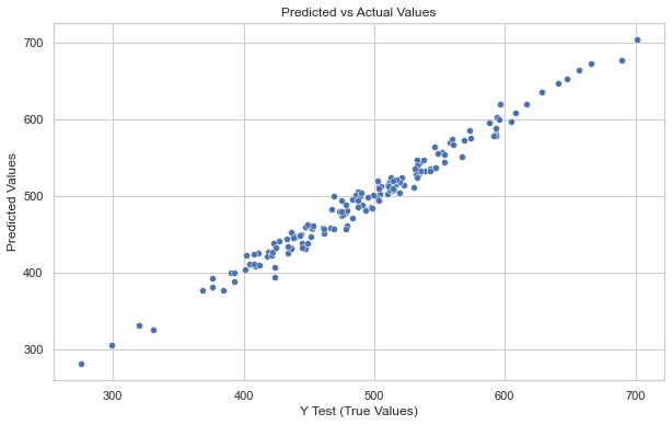
Majority of the points do lie on the straight line showing good accuracy of the model.
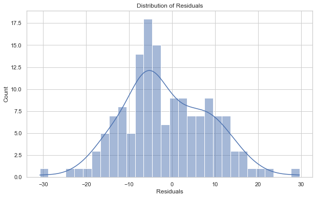
Plotting the residuals
The difference between predicted and actual values is called residuals
plt.figure(figsize=(10,6))

# Calculate the difference between the predicted and the actual values
residuals = y_test - predictions

# Generate a histogram with kde for the residuals
sns.histplot(residuals, kde=True, bins=30)

# Set the labels and title
plt.xlabel('Residuals')
plt.title('Distribution of Residuals')
Text(0.5, 1.0, 'Distribution of Residuals')
Model Metrics
To evaluate linear regression models, we can use the following metrics
- Mean Absolute Error (MAE) - This metric measures the average absolute difference between the predicted and actual values. The lower the value the better the model.
- Mean Squared Error (MSE) - This metric measures the average squared difference between the predicted and actual values. The lower the value the better the model.
- Root Mean Squared Error (RMSE) - This metric is the square root of MSE. It is measured in the same units as the target variable. The lower the value the better the model.
- R Squared - This is what percentage of the model is explained by the model. Higher values are better
# Calculate the metrics for the model
from sklearn.metrics import r2_score
r_squared = r2_score(y_test, predictions)
MAE = metrics.mean_absolute_error(y_test, predictions)
MSE = metrics.mean_squared_error(y_test, predictions)
RMSE = np.sqrt(MSE)

# create a dataframe of the metrics and print the model metrics
Metrics = [['MAE', 'MSE', 'RMSE', 'R Squared']]
met = pd.Series([MAE, MSE, RMSE, r_squared], index= Metrics)
met
MAE            8.426092
MSE          103.915541
RMSE          10.193897
R Squared      0.980876
dtype: float64
The model has a value has a R square value of 0.98 meaning that 98% percent of the variability in the data can be explained by the model.
In this example, we have seen the steps we can take in building linear model in python. Read more about it linear regression in the reference section. Additionally find the data in my github repository.
References
- Cross validation in machine learning. (2023, February 15). GeeksforGeeks
- Mckinney W (2018). Python for Data Analysis: DATA WRANGLING WITH PANDAS, NUMPY, AND IPYTHON (2nd Ed). Oriley.
- James, G., Witten, D., Hastie, T., Tibshirani, R., & Taylor, J. (2023). An introduction to statistical learning: With applications in Python. Springer Nature.